Case studiesدراسات حالة
A welcome you can hold: the Karibu Karak identity
ترحيب تحمله بيدك: هوية كاريبو كرك
How one Swahili word became a castle, a green and gold system, and a café people recognise from across the street.
كيف تحولت كلمة سواحيلية واحدة إلى قلعة، ونظام أخضر وذهبي، ومقهى يعرفه الناس من الطرف الآخر للشارع.
The name
A welcome you can hold.
"Karibu" means "welcome" in Swahili. For a karak café in Oman, that single word became the whole brief: make a place people feel invited into, then put that feeling on every cup, bag and wall.
The mark
Every welcome needs a place.
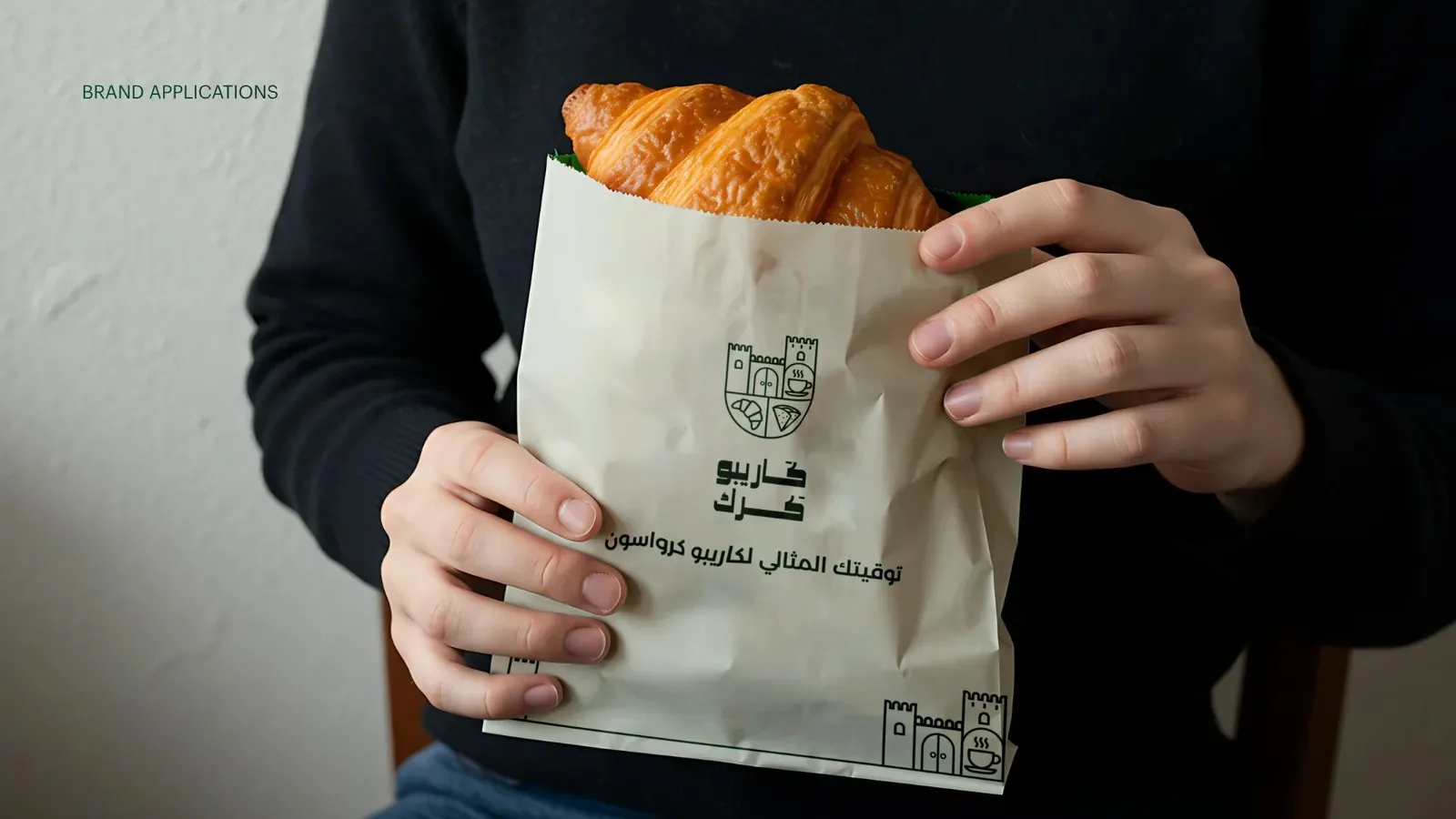
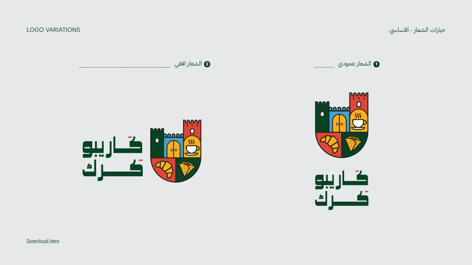
So the logo became a castle: a strong, friendly shape that reads as somewhere to walk into, not just something to look at.
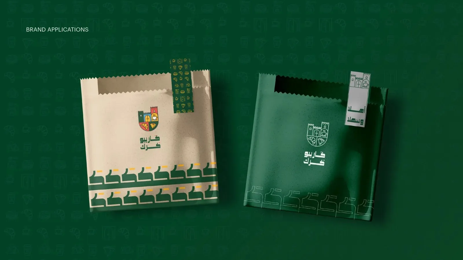
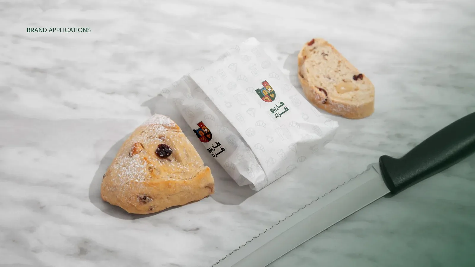
We drew it to work everywhere, from a full-color crest to a single-line icon small enough for a cup lid.
 a castle, built from one word
Color
Green for calm. Gold for warmth.
A deep green carries the brand and builds trust. Gold adds warmth and a sense of quality, and stands out on every cup. Four supporting colors keep menus, pattern and campaigns lively.
- Karibu green#014225
- Gold#FCB017
- Red#E24337
- Sky#46A2D0
- Stone#848F8F
- Sand#E9E6DC
 cups, croissants, keys and castles
What we made
- The identity
Name story, castle logo in every version, colors and type.
- The pattern
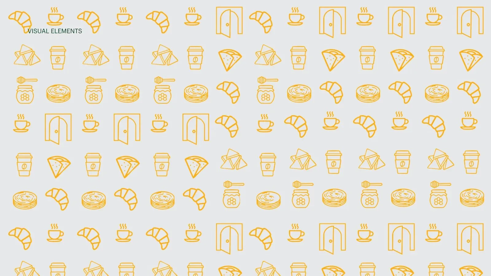
An icon set drawn from the café's world, turned into a pattern for packaging and walls.
- The packaging
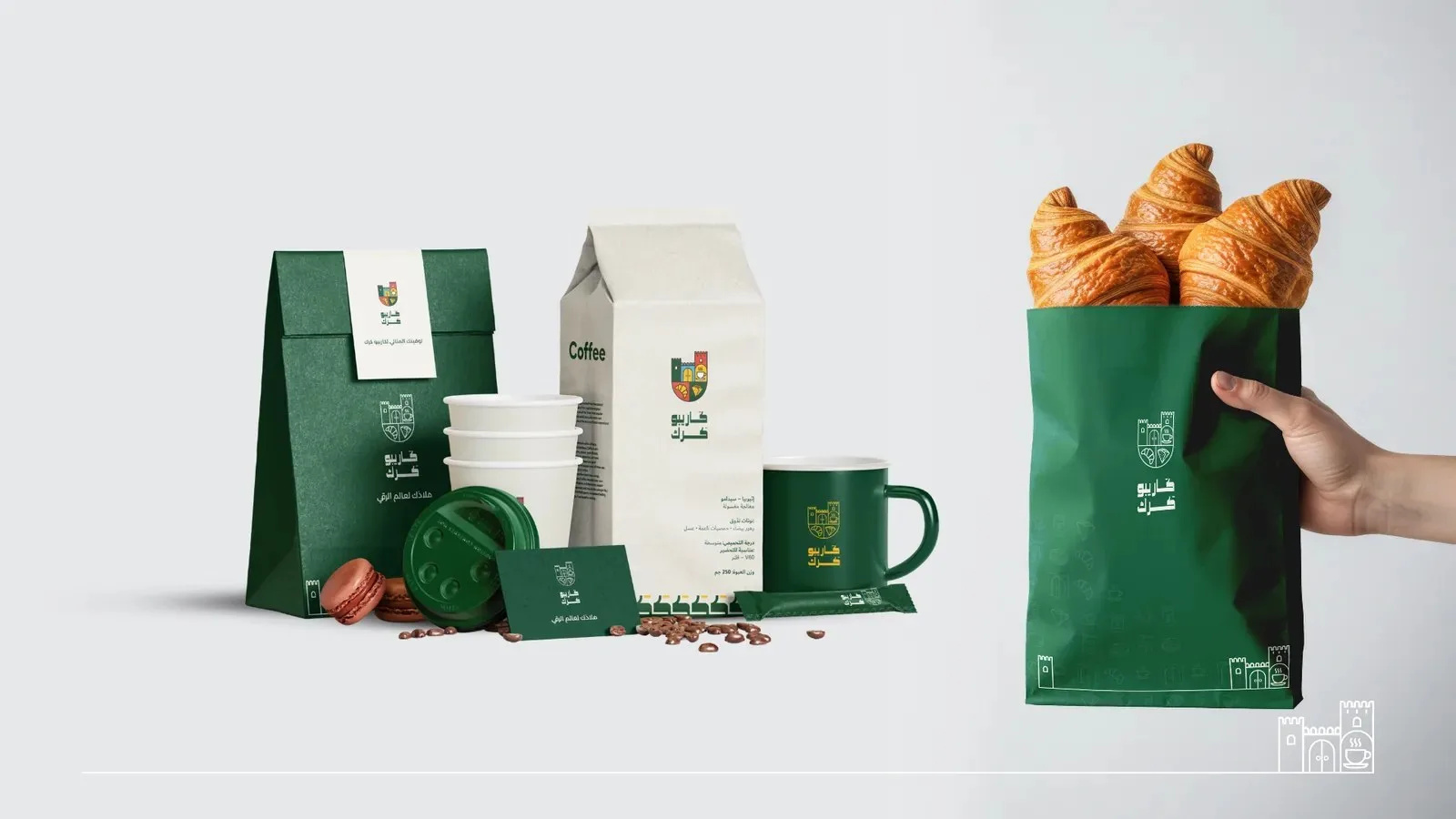
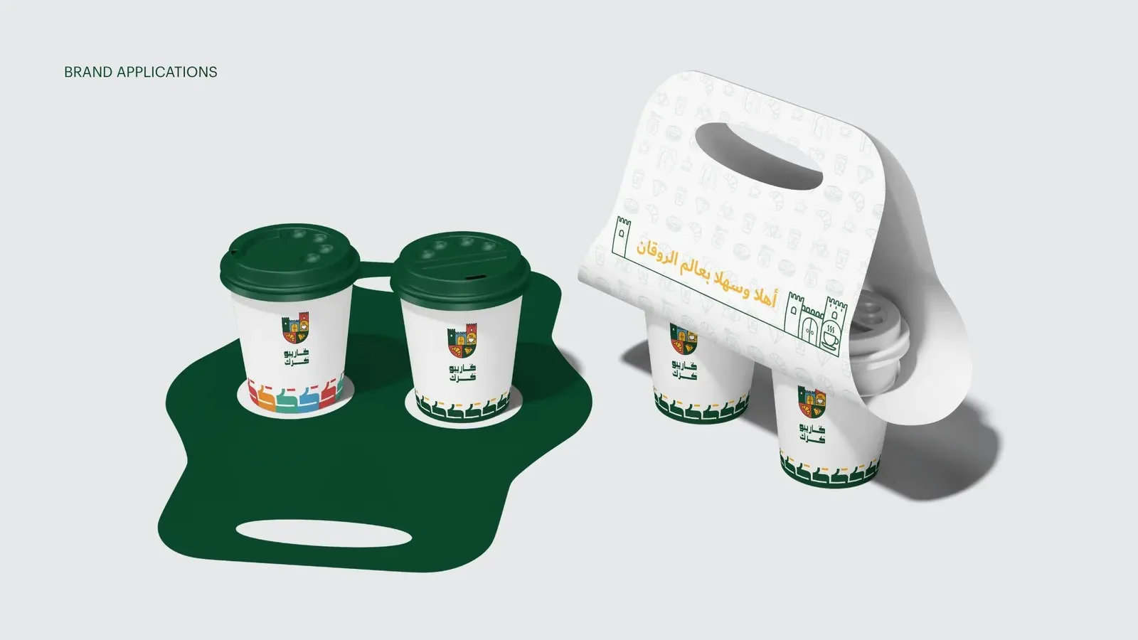
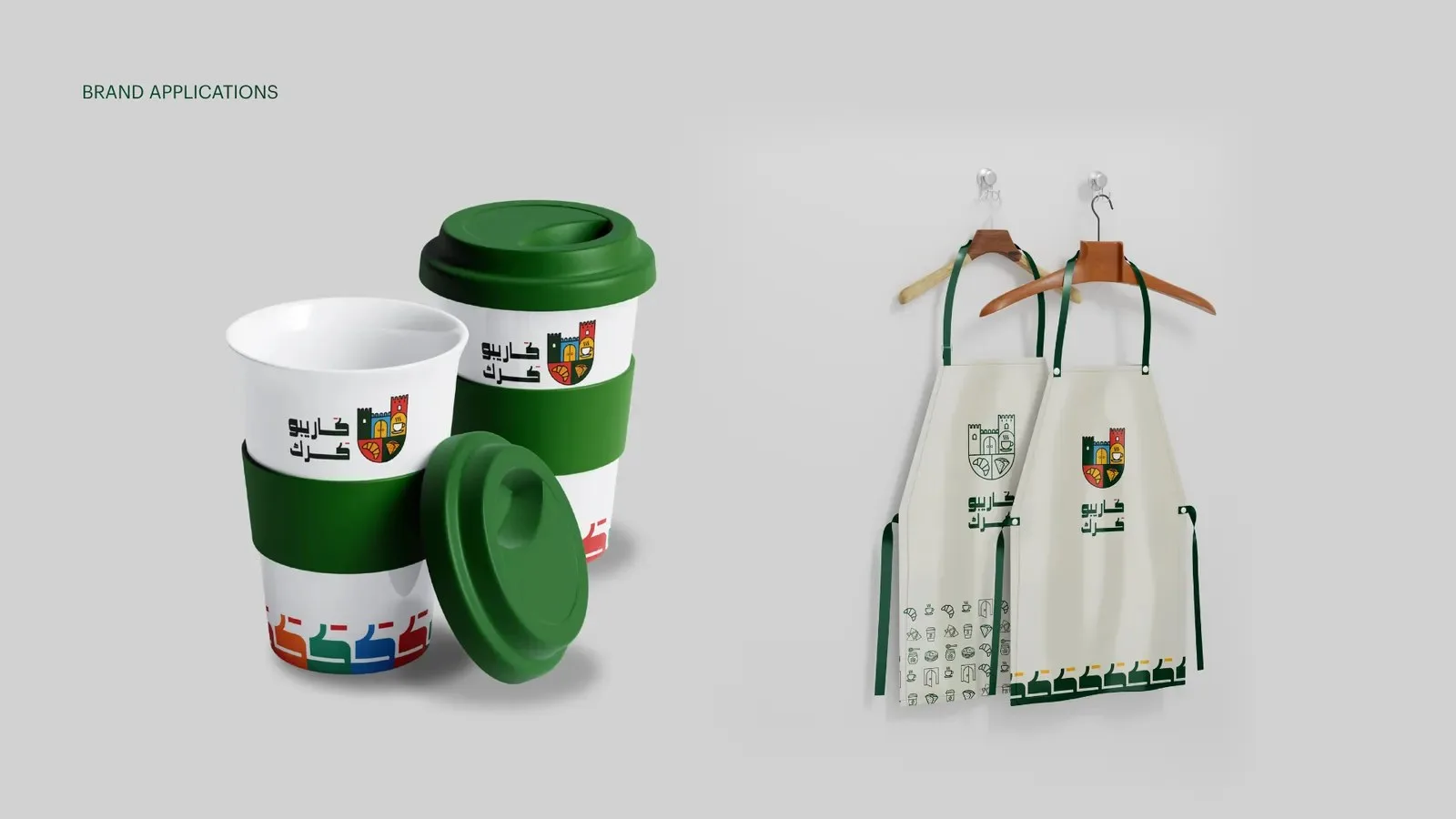
Cups, carriers, bags and wraps that are easy to spot in someone's hand.
- The shop
Shop front and interior, so the café feels like the brand from the first step inside.
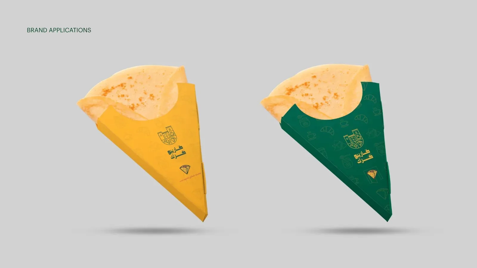
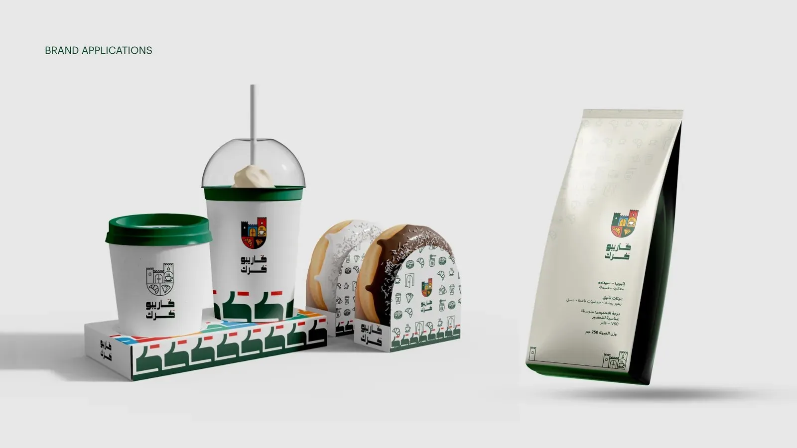
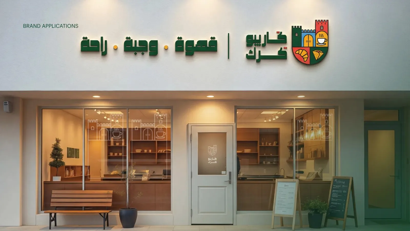
Every cup that leaves the shop carries the castle with it.
The Remote team
On social
The same welcome, online.
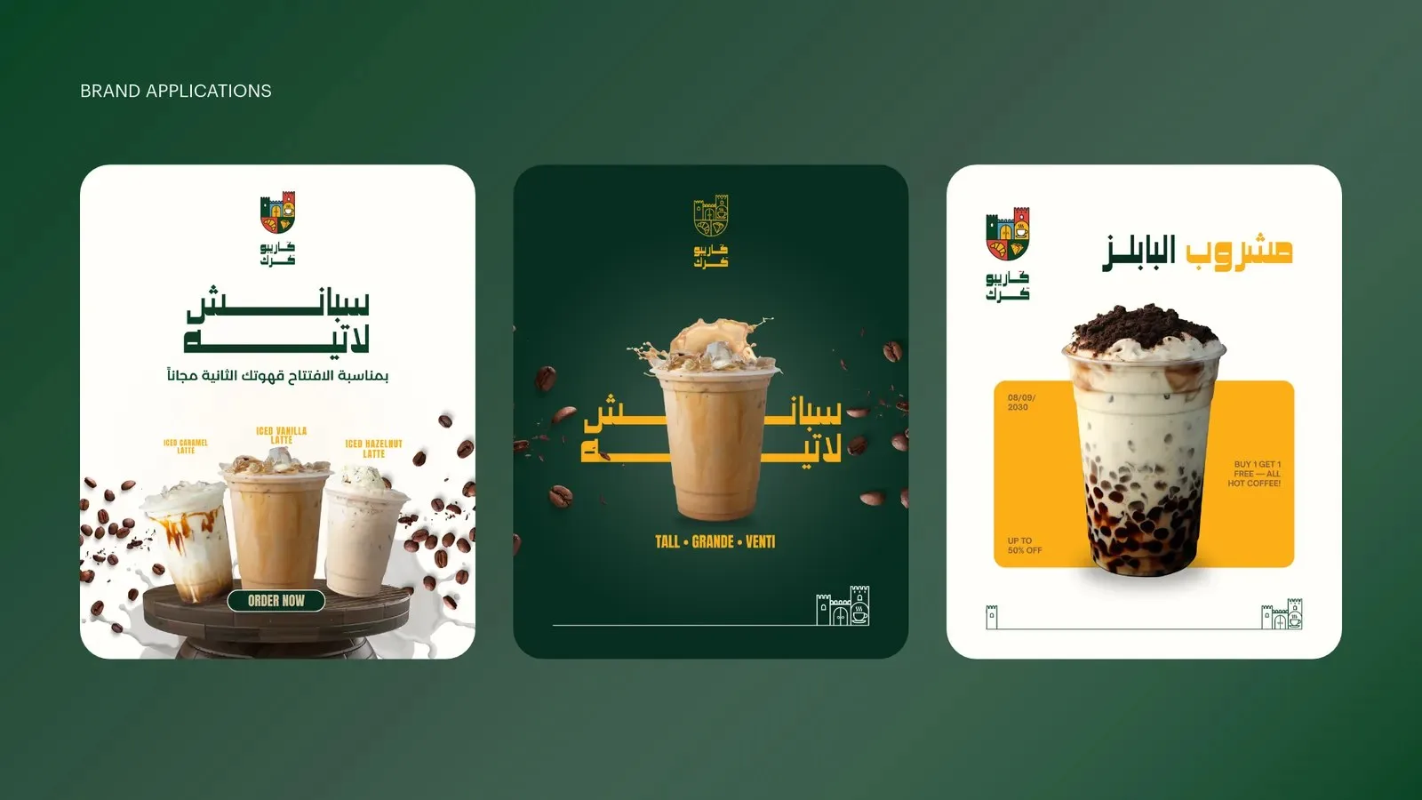
Launch posts use the same green, gold and castle, so the café looks the same on a phone screen as it does on the street.
الاسم
ترحيب تحمله بيدك.
«كاريبو» تعني «أهلاً وسهلاً» بالسواحيلية. ولمقهى كرك في عُمان، صارت هذه الكلمة وحدها هي الفكرة كلها: مكان يشعر الناس أنهم مدعوون إليه، ثم نضع هذا الإحساس على كل كوب وكيس وجدار.
الشعار
كل ترحيب يحتاج إلى مكان.
فأصبح الشعار قلعة: شكل قوي وودود، يُقرأ كمكان تدخله، لا مجرد رسم تنظر إليه.
رسمناه ليعمل في كل مكان، من الشعار الملوّن الكامل إلى أيقونة بخط واحد صغيرة بما يكفي لغطاء كوب.
قلعة من كلمة واحدةالألوان
أخضر للهدوء، وذهبي للدفء.
الأخضر الداكن يحمل العلامة ويبني الثقة، والذهبي يضيف الدفء والإحساس بالجودة ويبرز على كل كوب. وأربعة ألوان مساندة تمنح القوائم والنقشة والحملات حيوية.
- أخضر كاريبو#014225
- ذهبي#FCB017
- أحمر#E24337
- سماوي#46A2D0
- رمادي#848F8F
- رملي#E9E6DC
أكواب وكرواسون ومفاتيح وقلاعماذا صنعنا
- الهوية
قصة الاسم، وشعار القلعة بكل نسخه، والألوان والخطوط.
- النقشة
مجموعة أيقونات من عالم المقهى، تحولت إلى نقشة للتغليف والجدران.
- التغليف
أكواب وحوامل وأكياس وأغلفة يسهل تمييزها في يد العميل.
- المحل
الواجهة والتصميم الداخلي، ليشعر الزائر بالعلامة من أول خطوة.
كل كوب يخرج من المحل يحمل القلعة معه.
فريق ريموت
على السوشال ميديا
الترحيب نفسه، أونلاين.
منشورات الافتتاح تستخدم الأخضر والذهبي والقلعة نفسها، فيبدو المقهى على شاشة الجوال كما يبدو في الشارع.